If you had to make a choice, what badge would you like to see us use starting from next season?
1.Current
2.1987-2010
3.1983-1987
4.1969-1979
5.New
New Badge
-
huw.Y.WattfromWare
- Posts: 3393
- Joined: Fri May 08, 2020 7:04 pm
- Been Liked: 1004 times
- Has Liked: 905 times
-
simonclaret
- Posts: 1170
- Joined: Thu Jan 21, 2016 7:59 am
- Been Liked: 265 times
- Has Liked: 3610 times
- Location: North Yorkshire
-
Vintage Claret
- Posts: 2212
- Joined: Sun Jan 24, 2016 3:03 pm
- Been Liked: 935 times
- Has Liked: 608 times
-
WalkdenClaret
- Posts: 74
- Joined: Thu Jan 21, 2016 11:01 pm
- Been Liked: 23 times
- Has Liked: 21 times
- Location: Walkden
Re: New Badge
- Burnley-Logo-History.jpg (60.77 KiB) Viewed 4506 times
- BFsml.png (27.07 KiB) Viewed 4506 times
-
ClaretTony
- Posts: 67891
- Joined: Thu Dec 24, 2015 3:07 pm
- Been Liked: 32537 times
- Has Liked: 5277 times
- Location: Burnley
- Contact:
Re: New Badge
Don’t understand this. The first official club badge we ever had was established in 1973 and remained until 2010. The current one has been in use since 2010.
Re: New Badge
I guess what has appeared on our home shirt hasn’t always reflected that fact and that’s what’s being used here.ClaretTony wrote: ↑Thu Jan 28, 2021 11:56 pmDon’t understand this. The first official club badge we ever had was established in 1973 and remained until 2010. The current one has been in use since 2010.
I’d stick with our current badge.
-
Bin Ont Turf
- Posts: 10974
- Joined: Thu Jan 21, 2016 9:38 am
- Been Liked: 5188 times
- Has Liked: 804 times
- Location: On top of a pink elephant riding to the Democratic Republic of Congo
Re: New Badge
The 1979 one in the picture, all day long. Absolutely magnificent.
Till the cows come home.
Till the cows come home.
These 2 users liked this post: randomclaret2 expoultryboy
-
California Colner
- Posts: 1406
- Joined: Fri Jan 22, 2016 7:31 pm
- Been Liked: 172 times
- Has Liked: 115 times
- Location: Santa Clarita, LA
Re: New Badge
I would like to see the 1983 badge
Keep it simple
Keep it simple
-
ClaretTony
- Posts: 67891
- Joined: Thu Dec 24, 2015 3:07 pm
- Been Liked: 32537 times
- Has Liked: 5277 times
- Location: Burnley
- Contact:
Re: New Badge
Those images went up after I’d started posting but they aren’t club badges, just lettering and adaptations we’ve had on shirts.
The 1973 badge was created so we would have our own trademarked badge that we could use having previously used the old County Borough badge. It remained until 2010 but we used that old County Borough badge in 2009/10 for the 50th anniversary shirts. It coincided with us being in the Premier League and so the club felt it the right thing to do was to go with a similar adapted badge having had the global exposure for a year.
Some prefer one, some prefer the other.
-
Buxtonclaret
- Posts: 16751
- Joined: Thu Jan 21, 2016 9:05 am
- Been Liked: 3771 times
- Has Liked: 7571 times
- Location: Derbyshire
Re: New Badge
Remember my Mum stitching that '69 BFC onto a Claret & Blue shirt I'd got hold of in 1970.
-
tim_noone
- Posts: 17108
- Joined: Wed Mar 29, 2017 8:12 pm
- Been Liked: 4384 times
- Has Liked: 15117 times
Re: New Badge
I think The Strip Burnley played in Last night was the Best I've Ever seen....how long as that been around. Very Nice.
-
thelaughingclaret
- Posts: 900
- Joined: Sat Jan 23, 2016 5:23 pm
- Been Liked: 291 times
- Has Liked: 99 times
Re: New Badge
Personally I still prefer the old badge. The reason are it is the one I grew up with. The badge I fell in love with when I fell in love with the club. Just nostalgia really. I get used to the new one every season but I don’t think I will ever get that same feeling when looking at it as I get when I look at the old badge. The old badge defines ‘Burnley’ to me. For them who were around in the early sixties they will probably feel the same about that badge/shirt emblem/whatever is the political correct way to call whatever was on our shirt before 1973, and thus will probably like the new badge.
Re: New Badge
I'd be in favour of going back to the 1979 badge, or a new badge. The one currently used is a mess. It isn't distinctive and is too cluttered. It looks old and not in a good way at all.
A good question maybe is to ask which components of either badge do supporters think are most important to retain. What about both badges is most "Burnley"?
My thoughts -
1) Cotton making thingy (name escapes, apologies)
2) Bees
3) Hand
4) Red rose(s)
5) Zig zaggy bricks
For example, the cotton making thingy is one aspect which could be made more of. In a landscape of lions, that image is unique to the Burnley badge. It could be similar to the Liver bird on Liverpool shirts or the cockerel on Spurs' shirts.
Overall, people should see it and think - that's Burnley. I don't think the current badge does that at all. It's a horrible design.
And lose the weird bird. What is it? Does anyone know? What's on it's foot? Why?
Re: New Badge
1. Is it a shuttle?Pickles wrote: ↑Fri Jan 29, 2021 12:44 amI'd be in favour of going back to the 1979 badge, or a new badge. The one currently used is a mess. It isn't distinctive and is too cluttered. It looks old and not in a good way at all.
A good question maybe is to ask which components of either badge do supporters think are most important to retain. What about both badges is most "Burnley"?
My thoughts -
1) Cotton making thingy (name escapes, apologies)
2) Bees
3) Hand
4) Red rose(s)
5) Zig zaggy bricks
For example, the cotton making thingy is one aspect which could be made more of. In a landscape of lions, that image is unique to the Burnley badge. It could be similar to the Liver bird on Liverpool shirts or the cockerel on Spurs' shirts.
Overall, people should see it and think - that's Burnley. I don't think the current badge does that at all. It's a horrible design.
And lose the weird bird. What is it? Does anyone know? What's on it's foot? Why?
I’d go for a new, modern badge.
-
RammyClaret61
- Posts: 3100
- Joined: Sun Jan 03, 2016 9:46 pm
- Been Liked: 1131 times
- Has Liked: 301 times
- Location: Melbourne, Australia.
Re: New Badge
I’d prefer the 79 one. I don’t mind the current one other than the colours used. Much prefer the monochrome ones.
- F582EC69-B313-45EA-86BD-2DD42F8A5870.jpeg (199.26 KiB) Viewed 4311 times
These 2 users liked this post: BleedingClaret WalkdenClaret
-
mill hill claret
- Posts: 617
- Joined: Thu Jan 21, 2016 9:57 am
- Been Liked: 205 times
- Has Liked: 726 times
-
Oshkoshclaret
- Posts: 598
- Joined: Thu Jan 21, 2016 1:18 pm
- Been Liked: 318 times
- Has Liked: 83 times
- Location: Dallas, TX & Jefferson, MD
- Contact:
-
wilks_bfc
- Posts: 11530
- Joined: Thu Jan 21, 2016 12:33 pm
- Been Liked: 3189 times
- Has Liked: 1870 times
- Contact:
Re: New Badge
These aren’t right
The gold badge for 125 years was 2007 not 2010
-
Burnley1989
- Posts: 7406
- Joined: Sun Apr 08, 2018 2:19 am
- Been Liked: 2310 times
- Has Liked: 2174 times
Re: New Badge
Can’t make my mind up between 1979 and 1987, both great badges in different ways yet do similar
Really can’t choose
Really can’t choose
-
Culmclaret
- Posts: 1548
- Joined: Tue Jan 26, 2016 1:12 pm
- Been Liked: 473 times
- Has Liked: 52 times
Re: New Badge
Either the 69/70 to 74/5 or 75/6-78/9.
-
Father Jack
- Posts: 414
- Joined: Thu Jan 21, 2016 8:52 pm
- Been Liked: 148 times
- Has Liked: 23 times
- Location: Leyland
Re: New Badge
Thought this was interesting when I saw it at the time.
https://sportslens.com/the-burnley-cres ... ed/318512/
Our crest simplified and modernised by this person -
Shadab Wajih is an award-winning art director, graphic designer and an illustrator based in Miami, US. Besides his design and advertising work he also prides himself in his FIFA managerial skills. You can see more of his work, contact or complain to him on his Instagram: @snikt13
Personally I think it this would be a good evolution because this is the crest that most fans will know and associate us with from our time and exposure in the Premier League.
There’s definitely room to simplify and embolden key elements elements.
And I don’t think we’d have the same uproar in loosing the stork etc as Everton fans did when they lost their Latin moto as part of their own rebrand (at the link below for anyone interested).
https://www.canny-creative.com/everton- ... and-twice/
-
Claret Till I Die
- Posts: 2111
- Joined: Tue Dec 29, 2015 8:31 am
- Been Liked: 1150 times
- Has Liked: 1621 times
- Location: Worsthorne
Re: New Badge
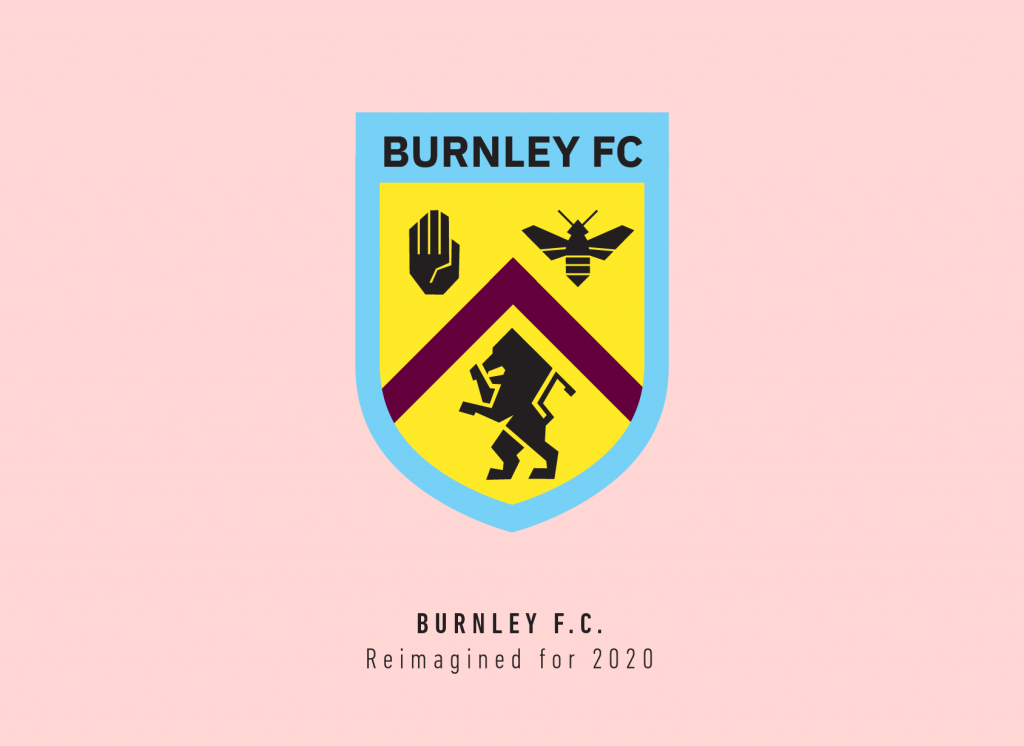
Really don't like thatFather Jack wrote: ↑Fri Jan 29, 2021 7:31 amThought this was interesting when I saw it at the time.
https://sportslens.com/the-burnley-cres ... ed/318512/
Our crest simplified and modernised by this person -
Shadab Wajih is an award-winning art director, graphic designer and an illustrator based in Miami, US. Besides his design and advertising work he also prides himself in his FIFA managerial skills. You can see more of his work, contact or complain to him on his Instagram: @snikt13
Personally I think it this would be a good evolution because this is the crest that most fans will know and associate us with from our time and exposure in the Premier League.
There’s definitely room to simplify and embolden key elements elements.
And I don’t think we’d have the same uproar in loosing the stork etc as Everton fans did when they lost their Latin moto as part of their own rebrand (at the link below for anyone interested).
https://www.canny-creative.com/everton- ... and-twice/
This user liked this post: bobinho
-
Suratclaret
- Posts: 1809
- Joined: Thu Jan 21, 2016 9:27 am
- Been Liked: 333 times
- Has Liked: 788 times
Re: New Badge
How about some reference to the new American owners...interestingly the state flag of Utah includes a bee hive...
Tin hat and sandbags at the ready.
On a more serious note as long as the badge continues to be dominated by some hideous logo ( I know this brings in money), I'm not sure whether tinkering with the design of the badge really matters.
Tin hat and sandbags at the ready.
On a more serious note as long as the badge continues to be dominated by some hideous logo ( I know this brings in money), I'm not sure whether tinkering with the design of the badge really matters.
-
Claretforever
- Posts: 2937
- Joined: Mon Jan 04, 2016 12:37 am
- Been Liked: 1035 times
- Has Liked: 509 times
Re: New Badge
I like that. Very smart.Father Jack wrote: ↑Fri Jan 29, 2021 7:31 amThought this was interesting when I saw it at the time.
https://sportslens.com/the-burnley-cres ... ed/318512/
Our crest simplified and modernised by this person -
Shadab Wajih is an award-winning art director, graphic designer and an illustrator based in Miami, US. Besides his design and advertising work he also prides himself in his FIFA managerial skills. You can see more of his work, contact or complain to him on his Instagram: @snikt13
Personally I think it this would be a good evolution because this is the crest that most fans will know and associate us with from our time and exposure in the Premier League.
There’s definitely room to simplify and embolden key elements elements.
And I don’t think we’d have the same uproar in loosing the stork etc as Everton fans did when they lost their Latin moto as part of their own rebrand (at the link below for anyone interested).
https://www.canny-creative.com/everton- ... and-twice/
The current badge looks a bit childlike to me. The yellow plays too much of a part in that it’s too bright, and the blue, to me, is too light. I actually don’t like the current blue (nearly white) we’re persisting with on the shirts either. I much prefer the 1960’s-early 1990’s blue which is slightly deeper.
-
Redbeard
- Posts: 2869
- Joined: Thu Jan 21, 2016 9:12 am
- Been Liked: 1438 times
- Has Liked: 2457 times
- Location: Aboard ship somewhere on the Med.
Re: New Badge
Sorry, but that's hideous. 
The 1979/87 one however is great.
The 1979/87 one however is great.
Re: New Badge
Same here. It was the letters on a claret square. I think I might still have it.Buxtonclaret wrote: ↑Fri Jan 29, 2021 12:13 amRemember my Mum stitching that '69 BFC onto a Claret & Blue shirt I'd got hold of in 1970.
This user liked this post: Buxtonclaret
Re: New Badge
PS The one we have now or the 59/60 anniversary one for me.
Re: New Badge
I like all the badges ... I follow a team not a badge ... but if I have to choose its the current one
Re: New Badge
combine old with new perhaps...?
I'm not saying I like this, or that my photoshop skills are any good (someone could de much better I'm sure)
...and the scroll with "Burnley Football Club" would need sorting - perhaps the latin phrase we used to have could go on the external scroll...?
Or just keep what we have, I like it
I'm not saying I like this, or that my photoshop skills are any good (someone could de much better I'm sure)
...and the scroll with "Burnley Football Club" would need sorting - perhaps the latin phrase we used to have could go on the external scroll...?
- Burnley new Crest.jpg (387.06 KiB) Viewed 3561 times
Or just keep what we have, I like it
-
gandhisflipflop
- Posts: 5543
- Joined: Thu Jan 21, 2016 8:05 pm
- Been Liked: 2340 times
- Has Liked: 1405 times
- Location: Costa del Padihamos beach.
Re: New Badge
2 all day long, as said further up i just dont get the same feeling anymore when i look at the current badge as i do with the badge in number 2.
Re: New Badge
That looks to be the worst of all worlds! Not nice at all!Father Jack wrote: ↑Fri Jan 29, 2021 7:31 amThought this was interesting when I saw it at the time.
https://sportslens.com/the-burnley-cres ... ed/318512/
Our crest simplified and modernised by this person -
Shadab Wajih is an award-winning art director, graphic designer and an illustrator based in Miami, US. Besides his design and advertising work he also prides himself in his FIFA managerial skills. You can see more of his work, contact or complain to him on his Instagram: @snikt13
Personally I think it this would be a good evolution because this is the crest that most fans will know and associate us with from our time and exposure in the Premier League.
There’s definitely room to simplify and embolden key elements elements.
And I don’t think we’d have the same uproar in loosing the stork etc as Everton fans did when they lost their Latin moto as part of their own rebrand (at the link below for anyone interested).
https://www.canny-creative.com/everton- ... and-twice/
-
Dark Cloud
- Posts: 6652
- Joined: Sun Jan 24, 2016 9:03 am
- Been Liked: 2006 times
- Has Liked: 3346 times
Re: New Badge
Number 1.
-
claretgimmer
- Posts: 544
- Joined: Thu Jan 21, 2016 10:49 am
- Been Liked: 151 times
- Has Liked: 693 times
Re: New Badge
If it`s not broken don`t fix it, current one for me.
-
gandhisflipflop
- Posts: 5543
- Joined: Thu Jan 21, 2016 8:05 pm
- Been Liked: 2340 times
- Has Liked: 1405 times
- Location: Costa del Padihamos beach.
Re: New Badge
It wasn't broken in 2010.
-
wilks_bfc
- Posts: 11530
- Joined: Thu Jan 21, 2016 12:33 pm
- Been Liked: 3189 times
- Has Liked: 1870 times
- Contact:
Re: New Badge
This is always going to cause division between supporters and it’ll be largely down to which badge you grew up with.
I started watching in 1988 so that’s the badge I grew up with.
As been said, if we hadn’t got promoted in 2009 which coincided with the 50th celebration kit using 1960 badge, we would have reverted back. As it was, and understandably, the club decided to stick with that as it had the “global recognition”
Let’s be honest - we’ve had a lot more success with this current one (in whichever guise) as the previous version
Re: New Badge
It's interesting to see everyone else's different opinions. I'm also in favour of the 1987 badge because that's the badge I associate Burnley with. However, I wouldn't be against a new, modern club crest. I've never understood the weird shading of the current one. It doesn't really look like a football crest either. The South Americans know how to design a football crest!
-
claretfern
- Posts: 668
- Joined: Thu Jan 21, 2016 10:36 am
- Been Liked: 138 times
- Has Liked: 1262 times
Re: New Badge
Current badge without doubt.
Re: New Badge
It's no good chopping and changing so I think the club did the right thing in keeping this badge after getting us in the Prem.
The 'reimagined' one looks like a 'stop! Beware of bees and angry bears!' Sign.
Think the stork is to represent a prominent family called Starkie from Padiham IIRC.
Don't know any South American badges exept the Newell's Old Boys one which is good.
The 'reimagined' one looks like a 'stop! Beware of bees and angry bears!' Sign.
Think the stork is to represent a prominent family called Starkie from Padiham IIRC.
Don't know any South American badges exept the Newell's Old Boys one which is good.
-
PremierLeagueClass
- Posts: 1309
- Joined: Sat Jan 30, 2016 12:49 pm
- Been Liked: 584 times
- Has Liked: 115 times
Re: New Badge
The old badge all day long, I’ve never spoken to anyone outside the club who disagrees. The old badge was one of the best around. The current badge is not good at all and needs modernising. Hopefully this is something the new chairman and his crew will address.
Re: New Badge
- south-american-football-club-icons.jpg (122.6 KiB) Viewed 3180 times
-
elwaclaret
- Posts: 8996
- Joined: Thu Jan 21, 2016 9:57 am
- Been Liked: 2013 times
- Has Liked: 2911 times
Re: New Badge
The 1973 badge for me. The design was by a local competition winner, the lions of Lancaster, the cotton shuttle, the bee of Lancashire industry and the red roses just part of the town significance, I ‘ve forgotten some other bits but THAT will always be our club badge for me, the new one I still think of as the ‘shirt badge’ rather than the club badge.
Re: New Badge
Those South American badges are mostly very modern looking. Could see the Leeds badges sitting amongst them,especially that smiley looking thing they had in the 70's.
If we had a new one a bee design would look good and make sense and we could have a black and amber away kit (again).
If we had a new one a bee design would look good and make sense and we could have a black and amber away kit (again).
-
box_of_frogs
- Posts: 4955
- Joined: Sat Jan 23, 2016 11:47 am
- Been Liked: 1087 times
- Has Liked: 996 times
Re: New Badge
1979 all day long. Come on Alan! Do the right thing!!
Re: New Badge
I grew up with the two lions crest, but do prefer the current one. I’ve nothing against the previous one other than I think it’s busy (in contrast to modern, marketing focussed designs) and is quite similar in style to other old crest designs.wilks_bfc wrote: ↑Fri Jan 29, 2021 9:58 amThis is always going to cause division between supporters and it’ll be largely down to which badge you grew up with.
I started watching in 1988 so that’s the badge I grew up with.
As been said, if we hadn’t got promoted in 2009 which coincided with the 50th celebration kit using 1960 badge, we would have reverted back. As it was, and understandably, the club decided to stick with that as it had the “global recognition”
Let’s be honest - we’ve had a lot more success with this current one (in whichever guise) as the previous version
Although actually old, the current crest is a little more minimal and therefore perhaps modern looking, but I don’t think it’s instantly recognisable as being Burnley.
I’d like a modern design, perhaps with a nod to tradition that easily identifiable (certainly not like the one posted further up with the odd shaped lions head).